


Aligning BI Dashboards with KPIs: A Business + Data Collaboration Guide
Last updated: November 28, 2025 Read in fullscreen view
- 01 Dec 2025
 Manufacturing 4.0: AI Agents Enabling Self-Optimizing Production Systems 64/104
 - 19 Oct 2021 Software development life cycles 56/730
- 13 Oct 2021 Outsourcing Software Development: MVP, Proof of Concept (POC) and Prototyping. Which is better? 53/510
- 12 Oct 2022 14 Common Reasons Software Projects Fail (And How To Avoid Them) 46/597
- 31 Aug 2022 What are the best practices for software contract negotiations? 46/301
- 01 Sep 2022 Facts Chart: Why Do Software Projects Fail? 46/625
- 14 Aug 2024 From Steel to Software: The Reluctant Evolution of Japan's Tech Corporates 46/575
- 28 Jul 2025 Data Modernization for SMBs: Small Steps, Big Impact 42/190
- 06 Nov 2025 DataOps: The Next Frontier in Agile Data Management 40/94
- 29 Jan 2026 Why Headless Commerce Is Shaping the Future of the Online Store 38/54
- 07 Jul 2021 The 5 Levels of IT Help Desk Support 33/488
- 05 Sep 2023 The Cold Start Problem: How to Start and Scale Network Effects 31/220
- 10 Apr 2021 RFP vs POC: Why the proof of concept is replacing the request for proposal 30/349
- 17 Mar 2025 Integrating Salesforce with Yardi: A Guide to Achieving Success in Real Estate Business 30/220
- 30 Oct 2022 How Much Does MVP Development Cost in 2023? 29/269
- 04 Oct 2021 Product Validation: The Key to Developing the Best Product Possible 28/331
- 07 Oct 2025 Case Study: Using the “Messaging House” Framework to Build a Digital Transformation Roadmap 28/99
- 03 Dec 2025 IT Outsourcing Solutions Explained: What, How, Why, When 28/53
- 22 May 2025 Role of Self-Service in CRM: Customer & Partner Portals for Automation 27/106
- 10 Jul 2025 Building AI-Driven Knowledge Graphs from Unstructured Data 27/182
- 17 Jun 2021 What is IT-business alignment? 26/389
- 16 Feb 2021 Choose Outsourcing for Your Non Disclosure Agreement (NDA) 25/193
- 16 Apr 2021 Insightful Business Technology Consulting at TIGO 25/447
- 07 Aug 2022 Things to Consider When Choosing a Technology Partner 24/294
- 28 Oct 2022 Build Operate Transfer (B.O.T) Model in Software Outsourcing 24/420
- 28 Jul 2022 POC, Prototypes, Pilots and MVP: What Are the Differences? 24/735
- 16 Aug 2022 What is a Headless CMS? 24/288
- 16 Sep 2022 Examples Of Augmented Intelligence In Today’s Workplaces Shaping the Business as Usual 23/451
- 04 Oct 2022 Which ERP implementation strategy is right for your business? 23/339
- 08 Aug 2022 Difference between Power BI and Datazen 23/348
- 08 Nov 2022 4 tips for meeting tough deadlines when outsourcing projects to software vendor 22/304
- 03 Nov 2022 Top questions and answers you must know before ask for software outsourcing 22/303
- 05 Mar 2021 How do you minimize risks when you outsource software development? 22/343
- 12 Dec 2021 Zero Sum Games Agile vs. Waterfall Project Management Methods 22/429
- 09 Mar 2022 Consultant Implementation Pricing 21/230
- 09 Jan 2022 How to Bridge the Gap Between Business and IT? 20/205
- 06 Mar 2024 [SemRush] What Are LSI Keywords & Why They Don‘t Matter 20/198
- 07 Oct 2022 Digital Transformation: Become a Technology Powerhouse 19/258
- 18 Jul 2021 How To Ramp Up An Offshore Software Development Team Quickly 18/602
- 01 Dec 2023 Laws of Project Management 18/323
- 09 Feb 2023 The Challenge of Fixed-Bid Software Projects 17/228
- 06 Mar 2021 4 things you need to do before getting an accurate quote for your software development 16/693
- 01 May 2023 CTO Interview Questions 15/344
- 12 Aug 2024 Understanding Google Analytics in Mumbai: A Beginner's Guide 14/107
- 05 Aug 2024 Revisiting the Mistake That Halted Japan's Software Surge 14/354
- 01 Mar 2023 How do you deal with disputes and conflicts that may arise during a software consulting project? 10/170
- 20 Nov 2022 Software Requirements Are A Communication Problem 8/248
- 01 May 2024 Warren Buffett’s Golden Rule for Digital Transformation: Avoiding Tech Overload 7/211
- 17 Mar 2025 IT Consultants in Digital Transformation 7/91
| About the Author | Anand Subramanian | Technology expert and AI enthusiast |
Anand Subramanian is a technology expert and AI enthusiast currently leading the marketing function at Intellectyx, a Data, Digital, and AI solutions provider with over a decade of experience working with enterprises and government departments. |
Introduction: When Dashboards Miss the Mark
Imagine walking into your Monday leadership meeting. A sleek BI dashboard is projected on the screen, filled with colorful charts and trend lines. Yet, as the discussion unfolds, it becomes clear that nobody knows how these visuals tie back to the company’s goals. Some team members interpret the data one way, others another. The room debates the dashboard rather than the strategy.
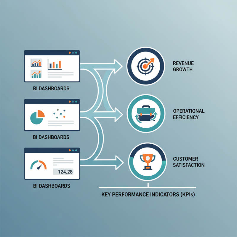
This scenario plays out in countless organizations. Business Intelligence (BI) dashboards are meant to empower decision-makers, but too often they become flashy displays that lack relevance. The missing link is alignment with Key Performance Indicators (KPIs). Without KPIs driving the design, dashboards risk becoming noise rather than clarity.
This article is a practical guide for business leaders and data teams to collaborate effectively, ensuring that BI dashboards truly serve as a compass for growth and performance.
Why KPI Alignment Matters
KPIs are not just numbers; they are commitments. They represent the targets an organization is striving for and the metrics that reflect progress. When dashboards are not aligned with KPIs, three things typically happen:
- Decision Paralysis: Leaders struggle to interpret what matters, delaying action.
- Misallocation of Resources: Teams optimize for vanity metrics instead of business-critical outcomes.
- Erosion of Trust in Data: Stakeholders lose confidence in dashboards, undermining the value of analytics initiatives.
On the flip side, when BI dashboards are intentionally designed around KPIs, organizations gain
- A single source of truth for performance conversations.
- Faster and more confident decision-making.
- A shared language that bridges the gap between business and data teams.
Step 1: Define KPIs in the Business Context
Before any dashboard is designed, leadership must answer a simple but tough question: What does success look like?
Too often, data teams are asked to build dashboards without clarity on the outcomes. To avoid this, start with a KPI workshop that involves both business stakeholders and data professionals.
- Link KPIs to strategic goals. For example, if the business goal is to improve customer retention, a relevant KPI could be churn rate or customer lifetime value.
- Keep them measurable and actionable. Vague statements like “increase customer satisfaction” should be grounded in metrics like Net Promoter Score (NPS).
- Limit the number. A dashboard overloaded with KPIs dilutes focus. Identify the top 5–7 that matter most.
By setting this foundation, you ensure that dashboards do not just visualize data, but illuminate the path toward business objectives.
Step 2: Translate KPIs into Data Requirements
Once KPIs are defined, the data team must translate them into measurable components. This step is often where misalignment occurs.
For example, consider a KPI like reducing order fulfillment time. To track this, data teams need clarity on:
- Which systems capture order creation and fulfillment data.
- The exact timestamp fields to use.
- How to calculate averages or distributions.
- Business leaders clarify the intent: “We want to reduce fulfillment time because it impacts customer satisfaction and repeat purchases.”
- Data teams respond with options: “We can measure fulfillment from order confirmation to shipment, or from shipment to delivery. Which aligns better with your goal?”
This back-and-forth ensures that the dashboard reflects the KPI accurately, avoiding the trap of measuring the wrong thing well.
Step 3: Design Dashboards for Decision-Making, Not Decoration
Too many dashboards fall into the trap of aesthetics over utility. A great BI dashboard is not an art project; it is a decision support system.
- Prioritize KPIs above all else. Place them front and center. Supporting metrics should complement, not overshadow.
- Context matters. A raw number is meaningless without trend lines, benchmarks, or targets. Always answer, Is this good or bad?
- Limit visual clutter. Every chart should answer a question tied to a KPI. Remove redundant or decorative visuals.
- Enable drill-downs. Leaders often want both the big picture and the ability to explore root causes. Provide both.
A well-designed dashboard does not overwhelm users with data. It guides them through a narrative of performance aligned with strategic goals.
Step 4: Build a Culture of Shared Ownership
Even the best-designed dashboard fails if it is not adopted. To ensure adoption, business and data teams must share ownership.
- Regular alignment meetings. Review dashboards in business meetings, not just analytics reviews.
- Feedback loops. Encourage users to suggest improvements or flag confusing metrics.
- Transparency in definitions. Maintain a data dictionary or glossary of KPI definitions accessible to all.
- Celebrate wins. Show how dashboard insights led to better decisions, reinforcing the value of collaboration.
By embedding dashboards into the rhythm of business, they evolve from static reports into living tools for growth.
Step 5: Avoid Common Pitfalls
Aligning BI dashboards with KPIs requires vigilance. Here are common traps and how to avoid them:
- Chasing vanity metrics. Metrics like “website visits” may look impressive but may not connect to revenue or customer outcomes. Ask, Does this metric change how we act?
- Over-customization. Every department asking for a “custom view” can fragment the data story. Create core dashboards that serve as the foundation.
- Static targets. Business environments change. Review and adjust KPIs quarterly to ensure relevance.
Lack of training. A dashboard is only as good as the user’s ability to interpret it. Invest in training sessions and office hours for business users.
Real-World Example: Aligning Dashboards in Financial Services
A mid-sized financial services firm was facing stagnant growth despite increasing customer acquisition. Their BI Financial dashboard was packed with charts showing new account sign-ups, call center activity, and customer demographics, but none of these explained why profitability was flat.
Through a KPI alignment workshop, the leadership team shifted focus from vanity metrics to business-critical ones such as net interest margin (NIM) and cost-to-income ratio. The data team then designed a new dashboard highlighting:
- Net interest margin trends segmented by product lines (loans, mortgages, credit cards).
- Cost-to-income ratio benchmarks across business units to identify operational inefficiencies.
Delinquency and default rates for high-risk customer segments that impacted profitability.
Within a quarter, the firm discovered that while customer acquisition was strong, a rising proportion of accounts were low-value or high-risk, leading to margin compression. By refining credit scoring models and reallocating marketing spend toward higher-value customer segments, they boosted net interest margin by 8 percent and reduced the cost-to-income ratio by 5 percent.
The lesson: dashboards gained real business impact only when they stopped tracking surface-level activity and instead focused on KPIs that directly influenced financial performance.
Action Steps to Get Started
If you want to realign your BI dashboards with KPIs, here is a step-by-step playbook you can act on this quarter:
- Schedule a KPI alignment workshop with business and data leaders.
- Select the top 5–7 KPIs that tie directly to strategic goals.
- Audit existing dashboards to assess alignment with these KPIs.
- Redesign dashboards around decision-making rather than decoration.
- Roll out training and feedback loops to drive adoption.
Review and iterate quarterly as business goals evolve.
Conclusion: From Dashboards to Decisions
A BI dashboard is not successful because it looks good or because it processes vast amounts of data. It is successful when it helps a business answer the right questions and act decisively. That requires deep collaboration between business leaders who set the vision and data teams who bring it to life.
Aligning BI dashboards with KPIs is not a one-time project but an ongoing partnership. When done right, dashboards stop being static reports and become living tools that accelerate growth, improve agility, and foster trust in data-driven decision-making.
The next time you look at a dashboard, ask yourself: Does this align with our KPIs? If the answer is no, it is time for a reset.
Anand Subramanian
Technology expert and AI enthusiast
Anand Subramanian is a technology expert and AI enthusiast currently leading the marketing function at Intellectyx, a Data, Digital, and AI solutions provider with over a decade of experience working with enterprises and government departments.


 is the software development portion of the Disciplined Agile Toolkit. DAD enables teams to make simplified process decisions around incremental and iterative solution delivery. DAD builds on the many practices espoused by advocates of agile software development, including scrum, agile modeling, lean software development, and others.")


.")


 Link copied!
 Recently Updated News