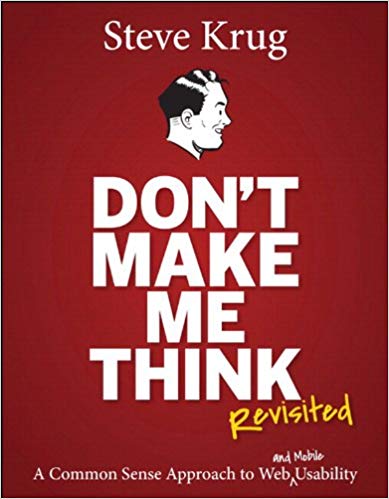
Don't Make Me Think
Last updated: January 14, 2024 Read in fullscreen view
- 19 Oct 2021
 Software development life cycles 59/733
 - 18 Oct 2020
 How to use the "Knowns" and "Unknowns" technique to manage assumptions 57/1134
 - 13 Oct 2021
 Outsourcing Software Development: MVP, Proof of Concept (POC) and Prototyping. Which is better? 53/510
 - 12 Oct 2022
 14 Common Reasons Software Projects Fail (And How To Avoid Them) 47/598
 - 31 Aug 2022
 What are the best practices for software contract negotiations? 47/303
 - 13 Dec 2020
 Move fast, fail fast, fail-safe 46/356
 - 01 Oct 2020
 Fail fast, learn faster with Agile methodology 43/1080
 - 06 Feb 2021
 Why fail fast and learn fast? 41/495
 - 14 Oct 2021
 Advantages and Disadvantages of Time and Material Contract (T&M) 36/900
 - 01 Dec 2025
 How UI/UX Design Accelerates Digital Transformation in Website Development 36/77
 - 18 Aug 2022
 What are the consequences of poor requirements with software development projects? 34/291
 - 05 Sep 2023
 The Cold Start Problem: How to Start and Scale Network Effects 31/220
 - 01 Mar 2023
 Bug Prioritization - What are the 5 levels of priority? 30/250
 - 08 Oct 2022
 KPI - The New Leadership 29/621
 - 04 Oct 2021
 Product Validation: The Key to Developing the Best Product Possible 29/332
 - 04 Oct 2022
 Which ERP implementation strategy is right for your business? 28/345
 - 07 Oct 2025
 Case Study: Using the “Messaging House” Framework to Build a Digital Transformation Roadmap 28/99
 - 05 Jan 2024
 Easy ASANA tips & tricks for you and your team 27/222
 - 28 Oct 2022
 Build Operate Transfer (B.O.T) Model in Software Outsourcing 27/423
 - 10 Dec 2023
 Pain points of User Acceptance Testing (UAT) 26/475
 - 23 Sep 2021
 INFOGRAPHIC: Top 9 Software Outsourcing Mistakes 25/447
 - 10 Nov 2022
 Poor Code Indicators and How to Improve Your Code? 25/241
 - 28 Jul 2022
 POC, Prototypes, Pilots and MVP: What Are the Differences? 25/737
 - 11 Jan 2024
 What are the Benefits and Limitations of Augmented Intelligence? 24/497
 - 12 Dec 2021
 Zero Sum Games Agile vs. Waterfall Project Management Methods 23/430
 - 28 Dec 2021
 8 types of pricing models in software development outsourcing 23/454
 - 05 Mar 2021
 How do you minimize risks when you outsource software development? 22/343
 - 17 Feb 2022
 Prioritizing Software Requirements with Kano Analysis 22/325
 - 12 Mar 2024
 How do you create FOMO in software prospects? 21/186
 - 19 Oct 2021
 Is gold plating good or bad in project management? 21/841
 - 19 Apr 2021
 7 Most Common Time-Wasters For Software Development 20/562
 - 01 Dec 2023
 Laws of Project Management 20/325
 - 06 Mar 2024
 [SemRush] What Are LSI Keywords & Why They Don‘t Matter 20/198
 - 18 Jul 2021
 How To Ramp Up An Offshore Software Development Team Quickly 19/603
 - 31 Oct 2021
 Tips to Fail Fast With Outsourcing 18/401
 - 26 Dec 2023
 Improving Meeting Effectiveness Through the Six Thinking Hats 18/275
 - 08 Feb 2024
 What is End User Efficiency? 17/488
 - 12 Aug 2024
 Understanding Google Analytics in Mumbai: A Beginner's Guide 14/107
 - 14 Mar 2024
 Why should you opt for software localization from a professional agency? 14/150
 - 06 Nov 2019
 How to Access Software Project Size? 14/260
 - 01 May 2024
 Warren Buffett’s Golden Rule for Digital Transformation: Avoiding Tech Overload 12/216
People won't use your web site if they can't find their way around it. Whether you call it usability, ease-of-use, or just good design, companies staking their fortunes and their futures on their Web sites are starting to recognize that it's a bottom-line issue. In Don't Make Me Think, usability expert Steve Krug distills his years of experience and observation into clear, practical--and often amusing--common sense advice for the people in the trenches (the designers, programmers, writers, editors, and Webmasters), the people who tell them what to do (project managers, business planners, and marketing people), and even the people who sign the checks.
I recently read Steve Krug's "Don't Make Me Think", an excellent book which describes some User Experience Design best practices. I wanted to share some key takeaways I learned from the book in this article which I think are useful/applicable for anyone that creates web content or interacts with Web Design:
- The highest priority in navigation is perhaps that decisions should be painless and intuitive; to some extent click count is secondary to intuitive decision making. As Krug puts it, "well-thought-out navigation is one of the best opportunities a site has to create a good impression".
- Along similar lines, due to the nature of web search and modern web use, having well thought out lower level pages is nearly as important as having well designed home pages.
- Perhaps most critical in Krug's discussion of usability is his discussion of the "myth of the average user". Rather than designing a page to fit the wants of this fictitious "average user" which more reflects the people in the room than the people using the website, Krug suggests it is more important to design a page to convey contextual content in a way that creates an intuitive experience for any user.
- How do we understand whether content layout effectively creates an intuitive experience? Krug says you observe people, even in small 2-3 person groups, actually using the website (small-scale usability testing).
- Krug also briefly discusses some accessibility practices, noting the strong moral imperative designers have to incorporate accessible design (aside from legal and financial motivations, which he also mentions). Krug says it is key to "Go for the low-hanging fruit", the issues which are common and as easy to fix as, for example, ensuring the existence of alt-text on images before publication of articles. Taking such steps are so important for improving user experience for accessible technology users and users with disabilities. Accessible design can be difficult, but even just these accessibility-related easy fixes can make a huge impact.
- If something requires a large investment of time — or looks like it will — it’s less likely to be used.
- Making every page or screen self-evident is like having good lighting in a store: it just makes everything seem better.
- A lot of happy talk is the kind of self-congratulatory promotional writing that you find in badly written brochures. Unlike good promotional copy, it conveys no useful information, and it focuses on saying how great we are, as opposed to delineating what makes us great. Instruction must die.
- Accessibility is the right thing to do. And not just the right thing; it’s profoundly the right thing to do, because the one argument for accessibility that doesn’t get made nearly often enough is how extraordinarily better it makes some people’s lives. How many opportunities do we have to dramatically improve people’s lives just by doing our job a little better?
- Another needless source of question marks over people’s heads is links and buttons that aren’t obviously clickable. As a user, I should never have to devote a millisecond of thought to whether things are clickable — or not.
- In the last few years, making things more usable has become almost everybody’s responsibility. Visual designers and developers now often find themselves doing things like interaction design (deciding what happens next when the user clicks, taps, or swipes) and information architecture (figuring out how everything should be organized).
- A person of average (or even below average) ability and experience can figure out how to use the thing to accomplish something without it being more trouble than it’s worth. Take my word for it: It’s really that simple.
- Usability is about people and how they understand and use things, not about technology.
- The main thing you need to know about instructions is that no one is going to read them — at least not until after repeated attempts at “muddling through” have failed.
- The more you watch users carefully and listen to them articulate their intentions, motivations, and thought processes, the more you realize that their individual reactions to Web pages are based on so many variables that attempts to describe users in terms of one-dimensional likes and dislikes are futile and counter-productive. Good design, on the other hand, takes this complexity into account.
- The fact that the people who built the site didn’t care enough to make things obvious — and easy — can erode our confidence in the site and the organization behind it.
- In reality, though, most of the time we don’t choose the best option — we choose the first reasonable option, a strategy known as satisficing.
- The problem is there are no simple “right” answers for most Web design questions (at least not for the important ones). What works is good, integrated design that fills a need — carefully thought out, well executed, and tested.
- Get rid of half the words on each page, then get rid of half of what’s left.
- Designers love subtle cues, because subtlety is one of the traits of sophisticated design. But Web users are generally in such a hurry that they routinely miss subtle cues.
- If there’s one thing you learn by working on a lot of different Web sites, it’s that almost any design idea — no matter how appallingly bad — can be made usable in the right circumstances, with enough effort.
- Your primary role should be to share what you know, not to tell people how things should be done.
- Your objective should always be to eliminate instructions entirely by making everything self-explanatory, or as close to it as possible. When instructions are absolutely necessary, cut them back to a bare minimum.
- Faced with the prospect of following a convention, there’s a great temptation for designers to try reinventing the wheel instead, largely because they feel (not incorrectly) that they’ve been hired to do something new and different, not the same old thing. Not to mention the fact that praise from peers, awards, and high-profile job offers are rarely based on criteria like “best use of conventions.” Occasionally, time spent reinventing the wheel results in a revolutionary new rolling device. But usually it just amounts to time spent reinventing the wheel.
- If you want a great site, you’ve got to test. After you’ve worked on a site for even a few weeks, you can’t see it freshly anymore. You know too much. The only way to find out if it really works is to test it.
Senior UI/UX Designer, TIGO Solutions.
















 Link copied!
 Recently Updated News